5 Lab 5: The Brain’s Two Minds: Default Mode vs. Executive Control

5.1 Learning Objectives
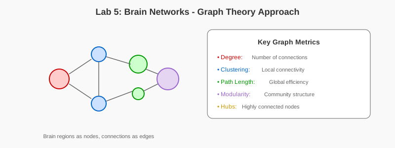
- Visualize brain connectivity as networks and graphs
- Analyze network topology using graph metrics
- Implement community detection and modularity analysis
- Model small-world and scale-free networks
- Connect brain network principles to neural network architectures
5.2 Prerequisites
- Reading: Chapter 5: Brain Networks
- Libraries: NumPy, Matplotlib, NetworkX
- Concepts: Graph theory, network analysis, connectivity
5.3 Setup
import numpy as np
import matplotlib.pyplot as plt
import networkx as nx
from scipy.spatial.distance import pdist, squareform

np.random.seed(42)
plt.style.use('default')
plt.rcParams['figure.figsize'] = (12, 8)
5.4 Part 1: Network Basics
5.4.1 1.1 Creating and Visualizing Networks
## Create a simple brain network
n_regions = 20
G = nx.Graph()

## Add nodes (brain regions)
regions = [f'Region_{i}' for i in range(n_regions)]
G.add_nodes_from(regions)

## Add edges (connections) - random for now
for i in range(n_regions):
    for j in range(i+1, n_regions):
        if np.random.rand() < 0.2:  # 20% connection probability
            weight = np.random.rand()
            G.add_edge(regions[i], regions[j], weight=weight)

## Visualize
plt.figure(figsize=(10, 10))
pos = nx.spring_layout(G, seed=42)
nx.draw_networkx_nodes(G, pos, node_size=500, node_color='lightblue',
                       edgecolors='black', linewidths=2)
nx.draw_networkx_labels(G, pos, font_size=8)
edges = G.edges()
weights = [G[u][v]['weight'] for u, v in edges]
nx.draw_networkx_edges(G, pos, width=[w*3 for w in weights], alpha=0.6)

plt.title('Simple Brain Network', fontsize=16, fontweight='bold')
plt.axis('off')
plt.tight_layout()
plt.show()

## Basic metrics
print(f"Number of nodes: {G.number_of_nodes()}")
print(f"Number of edges: {G.number_of_edges()}")
print(f"Average degree: {np.mean([d for n, d in G.degree()]):.2f}")
print(f"Network density: {nx.density(G):.3f}")
5.4.2 1.2 Degree Distribution
degrees = [d for n, d in G.degree()]

plt.figure(figsize=(10, 6))
plt.hist(degrees, bins=15, color='skyblue', edgecolor='black', alpha=0.7)
plt.xlabel('Degree (Number of Connections)', fontsize=12)
plt.ylabel('Frequency', fontsize=12)
plt.title('Degree Distribution', fontsize=14, fontweight='bold')
plt.grid(True, alpha=0.3)
plt.tight_layout()
plt.show()
Exercise 1.1: Create networks with different connection probabilities (0.1, 0.3, 0.5) and compare their density and degree distributions.
5.5 Part 2: Small-World Networks
5.5.1 2.1 Watts-Strogatz Model
def create_small_world_network(n=30, k=4, p=0.1):
    """Create small-world network using Watts-Strogatz model."""
    return nx.watts_strogatz_graph(n, k, p, seed=42)

## Create networks with varying rewiring probability
rewire_probs = [0, 0.1, 0.5, 1.0]
networks = [create_small_world_network(n=30, k=4, p=p) for p in rewire_probs]

fig, axes = plt.subplots(2, 2, figsize=(14, 14))
axes = axes.flatten()

for ax, G, p in zip(axes, networks, rewire_probs):
    pos = nx.circular_layout(G)
    nx.draw(G, pos, ax=ax, node_size=200, node_color='lightblue',
            with_labels=False, edge_color='gray', width=0.5)
    ax.set_title(f'Rewiring probability p = {p}', fontweight='bold')

plt.suptitle('Small-World Networks (Watts-Strogatz Model)',
            fontsize=16, fontweight='bold')
plt.tight_layout()
plt.show()

## Compute small-world metrics
for p, G in zip(rewire_probs, networks):
    C = nx.average_clustering(G)
    L = nx.average_shortest_path_length(G)
    print(f"p={p}: Clustering={C:.3f}, Path Length={L:.3f}")
5.5.2 2.2 Small-World Properties
## Sweep rewiring probability
p_values = np.logspace(-3, 0, 20)
clustering_coeffs = []
path_lengths = []

for p in p_values:
    G = create_small_world_network(n=100, k=6, p=p)
    C = nx.average_clustering(G)
    L = nx.average_shortest_path_length(G)
    clustering_coeffs.append(C)
    path_lengths.append(L)

## Normalize
C_norm = np.array(clustering_coeffs) / clustering_coeffs[0]
L_norm = np.array(path_lengths) / path_lengths[0]

plt.figure(figsize=(10, 6))
plt.semilogx(p_values, C_norm, 'o-', linewidth=2, label='Clustering (C/C₀)', color='blue')
plt.semilogx(p_values, L_norm, 's-', linewidth=2, label='Path Length (L/L₀)', color='red')
plt.xlabel('Rewiring Probability (p)', fontsize=12)
plt.ylabel('Normalized Value', fontsize=12)
plt.title('Small-World Transition', fontsize=14, fontweight='bold')
plt.legend(fontsize=11)
plt.grid(True, alpha=0.3)
plt.tight_layout()
plt.show()
Exercise 2.1: Calculate the “small-worldness” metric: σ = (C/C_random) / (L/L_random). Where is it maximized?
5.6 Part 3: Community Detection
5.6.1 3.1 Modular Networks
## Create network with clear modules
G_modular = nx.Graph()

## 3 modules with strong internal connections
modules = []
for m in range(3):
    module = list(range(m*10, (m+1)*10))
    modules.append(module)
    G_modular.add_nodes_from(module)

    # Dense connections within module
    for i in module:
        for j in module:
            if i < j and np.random.rand() < 0.7:
                G_modular.add_edge(i, j)

## Sparse connections between modules
for m1 in range(3):
    for m2 in range(m1+1, 3):
        for i in modules[m1]:
            for j in modules[m2]:
                if np.random.rand() < 0.05:
                    G_modular.add_edge(i, j)

## Detect communities
from networkx.algorithms import community
communities = community.greedy_modularity_communities(G_modular)

## Visualize
plt.figure(figsize=(10, 10))
pos = nx.spring_layout(G_modular, seed=42)

colors = ['red', 'blue', 'green']
for idx, comm in enumerate(communities):
    nx.draw_networkx_nodes(G_modular, pos, nodelist=list(comm),
                          node_color=colors[idx], node_size=300,
                          label=f'Module {idx+1}')

nx.draw_networkx_edges(G_modular, pos, alpha=0.2)
nx.draw_networkx_labels(G_modular, pos, font_size=8)

plt.title('Modular Network Structure', fontsize=16, fontweight='bold')
plt.legend()
plt.axis('off')
plt.tight_layout()
plt.show()

modularity = community.modularity(G_modular, communities)
print(f"Modularity: {modularity:.3f}")
Exercise 3.1: Create a network with 4-5 modules and varying inter-module connection strengths. How does this affect detected communities?
5.7 Part 4: Scale-Free Networks
5.7.1 4.1 Barabási-Albert Model
## Create scale-free network
G_scale_free = nx.barabasi_albert_graph(n=100, m=2, seed=42)

## Visualize
plt.figure(figsize=(12, 6))

## Network
plt.subplot(1, 2, 1)
pos = nx.spring_layout(G_scale_free, seed=42)
degrees = dict(G_scale_free.degree())
node_sizes = [v * 20 for v in degrees.values()]
nx.draw(G_scale_free, pos, node_size=node_sizes, node_color='lightcoral',
        with_labels=False, edge_color='gray', width=0.3, alpha=0.7)
plt.title('Scale-Free Network\\n(node size ∝ degree)', fontweight='bold')

## Degree distribution (log-log)
plt.subplot(1, 2, 2)
degrees = [d for n, d in G_scale_free.degree()]
degree_counts = {}
for d in degrees:
    degree_counts[d] = degree_counts.get(d, 0) + 1

x = list(degree_counts.keys())
y = list(degree_counts.values())
plt.loglog(x, y, 'o', markersize=8, color='darkred')
plt.xlabel('Degree (k)', fontsize=12)
plt.ylabel('Frequency P(k)', fontsize=12)
plt.title('Degree Distribution\\n(Power-law)', fontweight='bold')
plt.grid(True, alpha=0.3)

plt.tight_layout()
plt.show()
Exercise 4.1: Compare random, small-world, and scale-free networks on the same axes. How do their degree distributions differ?
5.8 Part 5: Hub Analysis
## Identify hubs
degrees = dict(G_scale_free.degree())
sorted_nodes = sorted(degrees.items(), key=lambda x: x[1], reverse=True)
top_hubs = sorted_nodes[:5]

print("Top 5 hubs:")
for node, degree in top_hubs:
    print(f"  Node {node}: degree = {degree}")

## Visualize highlighting hubs
plt.figure(figsize=(10, 10))
pos = nx.spring_layout(G_scale_free, seed=42)

## Regular nodes
regular_nodes = [n for n, d in sorted_nodes[5:]]
nx.draw_networkx_nodes(G_scale_free, pos, nodelist=regular_nodes,
                      node_size=100, node_color='lightgray')

## Hub nodes
hub_nodes = [n for n, d in top_hubs]
nx.draw_networkx_nodes(G_scale_free, pos, nodelist=hub_nodes,
                      node_size=800, node_color='red',
                      edgecolors='black', linewidths=2)

nx.draw_networkx_edges(G_scale_free, pos, alpha=0.2, width=0.5)

## Label hubs
hub_labels = {n: str(n) for n, d in top_hubs}
nx.draw_networkx_labels(G_scale_free, pos, labels=hub_labels,
                       font_size=12, font_weight='bold')

plt.title('Scale-Free Network with Hub Nodes Highlighted',
         fontsize=16, fontweight='bold')
plt.axis('off')
plt.tight_layout()
plt.show()
5.9 Part 6: DMN and ECN Network Analysis
5.9.1 6.1 Simulated Functional Connectivity Matrix
In this section, we analyze the functional connectivity between Default Mode Network (DMN) and Executive Control Network (ECN) regions. Run this cell to generate a simulated functional connectivity matrix and visualize it as both a heatmap and a network graph.
import numpy as np
import matplotlib.pyplot as plt
import networkx as nx
import pandas as pd
import seaborn as sns

def generate_connectivity_matrix(seed=42):
    """Generate a simulated functional connectivity matrix."""
    np.random.seed(seed)
    dmn_regions = ['mPFC', 'PCC', 'AngularL', 'AngularR']
    ecn_regions = ['dlPFC_L', 'dlPFC_R', 'IPS_L', 'IPS_R']
    region_names = dmn_regions + ecn_regions
    network_labels = ['DMN'] * 4 + ['ECN'] * 4
    n_regions = len(region_names)

    conn_matrix = np.zeros((n_regions, n_regions))
    # High within-network connectivity
    conn_matrix[:4, :4] = 0.7 + np.random.rand(4, 4) * 0.2
    conn_matrix[4:, 4:] = 0.6 + np.random.rand(4, 4) * 0.2
    # Negative between-network connectivity
    conn_matrix[:4, 4:] = -0.4 - np.random.rand(4, 4) * 0.2
    conn_matrix[4:, :4] = conn_matrix[:4, 4:].T

    np.fill_diagonal(conn_matrix, 1.0)
    return conn_matrix, region_names, network_labels

def analyze_and_plot_network(conn_matrix, region_names, network_labels):
    """Visualize connectivity and plot the network graph."""
    # Plot heatmap
    plt.figure(figsize=(8, 6))
    sns.heatmap(conn_matrix, xticklabels=region_names, yticklabels=region_names,
                cmap='coolwarm', vmin=-1, vmax=1, center=0)
    plt.title('Simulated Functional Connectivity Matrix')
    plt.show()

    # Create graph
    G = nx.from_numpy_array(np.abs(conn_matrix))
    for i, name in enumerate(region_names):
        G.nodes[i]['name'] = name
        G.nodes[i]['network'] = network_labels[i]

    # Plot graph
    plt.figure(figsize=(10, 8))
    pos = nx.spring_layout(G, seed=42, k=0.9)
    colors = ['skyblue' if G.nodes[i]['network'] == 'DMN' else 'salmon' for i in G.nodes()]
    sizes = [d*500 for n,d in nx.degree(G, weight='weight')]
    nx.draw(G, pos, with_labels=True, labels={i: name for i, name in enumerate(region_names)},
            node_color=colors, node_size=sizes, font_weight='bold')
    plt.title('Brain Network Graph (Size by Degree)')
    plt.show()

# Run Analysis
conn_matrix, region_names, network_labels = generate_connectivity_matrix()
analyze_and_plot_network(conn_matrix, region_names, network_labels)
Exercise 6.1: Modify the generate_connectivity_matrix function to simulate a “depressed” brain state where DMN within-network connectivity is increased to 0.85. Compare the resulting network structure.
5.9.2 6.2 Simulating Network Dynamics
This section simulates the dynamic interplay between DMN and ECN, demonstrating their anticorrelated activity patterns and response to task engagement.
import numpy as np
import matplotlib.pyplot as plt

def simulate_network_dynamics(duration=300, sampling_rate=1, task_periods=None):
    """Simulate the dynamic interplay between DMN and ECN."""
    n_samples = int(duration * sampling_rate)
    time = np.linspace(0, duration, n_samples)

    # Generate intrinsic, slow oscillations for each network
    dmn_intrinsic = np.sin(2 * np.pi * 0.02 * time) + np.random.randn(n_samples) * 0.5
    ecn_intrinsic = np.sin(2 * np.pi * 0.03 * time + np.pi) + np.random.randn(n_samples) * 0.5

    # Add anti-correlation
    dmn_activity = dmn_intrinsic - 0.5 * ecn_intrinsic
    ecn_activity = ecn_intrinsic - 0.5 * dmn_intrinsic

    # Simulate task engagement
    if task_periods:
        for start, end in task_periods:
            task_mask = (time >= start) & (time <= end)
            ecn_activity[task_mask] += 1.5
            dmn_activity[task_mask] -= 1.0

    # Normalize for plotting
    dmn_activity = (dmn_activity - np.mean(dmn_activity)) / np.std(dmn_activity)
    ecn_activity = (ecn_activity - np.mean(ecn_activity)) / np.std(ecn_activity)

    return time, dmn_activity, ecn_activity

# Simulation & Visualization
task_periods = [(50, 100), (200, 250)]
time, dmn_activity, ecn_activity = simulate_network_dynamics(task_periods=task_periods)

plt.figure(figsize=(14, 6))
plt.plot(time, dmn_activity, color='skyblue', label='Default Mode Network (DMN)')
plt.plot(time, ecn_activity, color='salmon', label='Executive Control Network (ECN)')

for start, end in task_periods:
    plt.axvspan(start, end, color='grey', alpha=0.3, label='Task Engagement')

plt.title('Dynamic Interplay Between DMN and ECN')
plt.xlabel('Time (seconds)')
plt.ylabel('Network Activity (Normalized)')
# Create a clean legend
handles, labels = plt.gca().get_legend_handles_labels()
by_label = dict(zip(labels, handles))
plt.legend(by_label.values(), by_label.keys())
plt.grid(True, linestyle='--', alpha=0.6)
plt.show()

correlation = np.corrcoef(dmn_activity, ecn_activity)[0, 1]
print(f"Overall correlation between DMN and ECN: {correlation:.2f}")
Exercise 6.2: Add a third “Salience Network” signal that triggers transitions between DMN and ECN dominance. How does this affect the correlation between networks?
5.9.3 6.3 Simulating Anti-Correlated Network Dynamics (From Chapter 5)
This section demonstrates how to simulate the dynamic interplay between the Default Mode Network (DMN) and Executive Control Network (ECN), showing their characteristic anti-correlated activity patterns and response to task engagement. Run this cell to see how these networks dynamically interact over time.
import numpy as np
import matplotlib.pyplot as plt

def simulate_network_dynamics(duration=300, sampling_rate=1, task_periods=None):
    """Simulate the dynamic interplay between DMN and ECN.

    Parameters:
    -----------
    duration : float
        Total simulation time in seconds
    sampling_rate : float
        Number of samples per second
    task_periods : list of tuples
        List of (start, end) times for task engagement periods

    Returns:
    --------
    time : array
        Time points
    dmn_activity : array
        Normalized DMN activity time series
    ecn_activity : array
        Normalized ECN activity time series
    """
    n_samples = int(duration * sampling_rate)
    time = np.linspace(0, duration, n_samples)

    # Generate intrinsic, slow oscillations for each network
    # DMN oscillates at ~0.02 Hz (slow oscillation)
    dmn_intrinsic = np.sin(2 * np.pi * 0.02 * time) + np.random.randn(n_samples) * 0.5
    # ECN oscillates at ~0.03 Hz with phase offset
    ecn_intrinsic = np.sin(2 * np.pi * 0.03 * time + np.pi) + np.random.randn(n_samples) * 0.5

    # Add anti-correlation between networks
    dmn_activity = dmn_intrinsic - 0.5 * ecn_intrinsic
    ecn_activity = ecn_intrinsic - 0.5 * dmn_intrinsic

    # Simulate task engagement effects
    if task_periods:
        for start, end in task_periods:
            task_mask = (time >= start) & (time <= end)
            ecn_activity[task_mask] += 1.5  # ECN increases during tasks
            dmn_activity[task_mask] -= 1.0  # DMN decreases during tasks

    # Normalize for plotting (z-score normalization)
    dmn_activity = (dmn_activity - np.mean(dmn_activity)) / np.std(dmn_activity)
    ecn_activity = (ecn_activity - np.mean(ecn_activity)) / np.std(ecn_activity)

    return time, dmn_activity, ecn_activity

# Run simulation with task periods
task_periods = [(50, 100), (200, 250)]
time, dmn_activity, ecn_activity = simulate_network_dynamics(task_periods=task_periods)

# Create visualization
plt.figure(figsize=(14, 6))
plt.plot(time, dmn_activity, color='skyblue', linewidth=2,
         label='Default Mode Network (DMN)')
plt.plot(time, ecn_activity, color='salmon', linewidth=2,
         label='Executive Control Network (ECN)')

# Highlight task engagement periods
for start, end in task_periods:
    plt.axvspan(start, end, color='grey', alpha=0.3, label='Task Engagement')

# Formatting
plt.title('Dynamic Interplay Between DMN and ECN', fontsize=16, fontweight='bold')
plt.xlabel('Time (seconds)', fontsize=12)
plt.ylabel('Network Activity (Normalized)', fontsize=12)

# Create a clean legend without duplicates
handles, labels = plt.gca().get_legend_handles_labels()
by_label = dict(zip(labels, handles))
plt.legend(by_label.values(), by_label.keys(), fontsize=11)

plt.grid(True, linestyle='--', alpha=0.6)
plt.tight_layout()
plt.show()

# Calculate and display correlation
correlation = np.corrcoef(dmn_activity, ecn_activity)[0, 1]
print(f"Overall correlation between DMN and ECN: {correlation:.2f}")
print("\nKey observations:")
print("1. DMN and ECN show anti-correlated activity (negative correlation)")
print("2. During task periods (grey boxes), ECN increases while DMN decreases")
print("3. Outside tasks, the networks show intrinsic anti-correlated oscillations")
Exercise 6.3: Modify the simulation parameters: - Change the oscillation frequencies (0.02 and 0.03 Hz) and observe how this affects the correlation - Increase the anti-correlation strength (currently 0.5) and describe the impact - Add a third network (e.g., Salience Network) that triggers switches between DMN and ECN
Exercise 6.4: Create a “depressed” brain state simulation where: - DMN baseline activity is elevated - Anti-correlation is reduced - Task-induced DMN suppression is weaker Compare the time series and correlation with the healthy baseline.
5.10 Exercises
5.10.1 Exercise 1: Rich Club Analysis
Analyze whether high-degree nodes connect preferentially to each other.
5.10.2 Exercise 2: Efficiency Metrics
Calculate global and local efficiency for different network types.
5.10.3 Exercise 3: Robustness
Test network robustness to random vs. targeted attacks on hubs.
5.10.4 Exercise 4: Dynamic Networks
Simulate network growth and observe emergence of structure.
5.11 Challenge Problems
5.11.1 Challenge 1: Real Brain Network
Load a real brain connectivity dataset and analyze its network properties.
5.11.2 Challenge 2: Neural Architecture Search
Design a CNN architecture inspired by brain network principles.
5.11.3 Challenge 3: Information Flow
Simulate information propagation through different network topologies.
5.12 Discussion Questions
5.12.1 Question 1: Small-World in the Brain
Why are small-world networks beneficial for brain function?
5.12.2 Question 2: Modularity and Specialization
How does modular structure support specialized processing?
5.12.3 Question 3: Network Architectures in AI
How do brain network principles inform neural network design?
5.13 Summary
You’ve explored network topology, small-world properties, community structure, and scale-free networks - all fundamental to understanding brain organization and inspiring AI architectures.