9 Lab 9: Causal Inference in NeuroAI

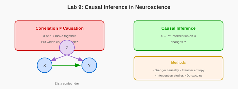
9.1 Learning Objectives
- Distinguish correlation from causation in neural data
- Implement Granger causality and transfer entropy
- Apply interventional analysis and counterfactual reasoning
- Visualize causal graphs and directed information flow
- Design experiments to test causal hypotheses
9.2 Prerequisites
- Reading: Chapter 9: Causal Inference
- Libraries: NumPy, Matplotlib, NetworkX, Statsmodels, Scikit-learn, PyTorch
- Concepts: Time series analysis, conditional independence, DAGs
9.3 Setup
Run this cell to import all required libraries and set up the environment:
import numpy as np
import matplotlib.pyplot as plt
import networkx as nx
from statsmodels.tsa.stattools import grangercausalitytests
from scipy.stats import pearsonr
from sklearn.linear_model import LinearRegression

np.random.seed(42)
plt.rcParams['figure.figsize'] = (12, 8)
9.4 Part 1: Building Causal DAGs
Causal graphs (Directed Acyclic Graphs) provide a formal language for representing causal relationships. Run this cell to visualize a causal DAG for a neuroscience experiment.
# Run this cell to visualize a causal DAG for a neuroscience experiment
# Example: Does V1 activity cause motor cortex activity during a visual task?
# - Stimulus causes both V1 and motor cortex activity (confounder)
# - V1 may also directly influence motor cortex

from matplotlib.patches import FancyBboxPatch

def plot_causal_dag():
    """
    Visualize a causal DAG for a neuroscience experiment.

    Example: Does V1 activity cause motor cortex activity during a visual task?
    - Stimulus causes both V1 and motor cortex activity (confounder)
    - V1 may also directly influence motor cortex
    """
    G = nx.DiGraph()

    # Add nodes
    nodes = ['Stimulus', 'V1', 'Motor', 'Behavior']
    G.add_nodes_from(nodes)

    # Add edges (causal relationships)
    edges = [
        ('Stimulus', 'V1'),
        ('Stimulus', 'Motor'),
        ('V1', 'Motor'),
        ('Motor', 'Behavior')
    ]
    G.add_edges_from(edges)

    # Layout
    pos = {
        'Stimulus': (0, 1),
        'V1': (1, 1.5),
        'Motor': (2, 1),
        'Behavior': (3, 1)
    }

    # Plot
    fig, ax = plt.subplots(figsize=(10, 6))

    # Draw nodes
    nx.draw_networkx_nodes(G, pos, node_color='#cc0000',
                           node_size=3000, alpha=0.9, ax=ax)

    # Draw edges
    nx.draw_networkx_edges(G, pos, width=2, alpha=0.6,
                           edge_color='#333333',
                           arrowsize=20, arrowstyle='->', ax=ax)

    # Draw labels
    nx.draw_networkx_labels(G, pos, font_size=12,
                            font_weight='bold', font_color='white', ax=ax)

    ax.set_xlim(-0.5, 3.5)
    ax.set_ylim(0.5, 2)
    ax.axis('off')
    ax.set_title('Causal DAG: Visual Task Experiment', fontsize=14, pad=20)

    plt.tight_layout()
    plt.show()

plot_causal_dag()
Interpretation: In this DAG, the Stimulus is a confounder - it causes both V1 and Motor activity. If we only observe correlations between V1 and Motor, we cannot tell if V1 causes Motor (direct effect), Stimulus causes both (confounding), or both mechanisms are present.
9.5 Part 2: Optogenetics as Intervention
This simulation demonstrates how optogenetics enables causal inference by comparing observational vs. interventional data.
# Run this cell to simulate an optogenetics experiment
# This demonstrates causal inference by comparing observational vs. interventional data

def simulate_optogenetics_experiment(n_trials=1000):
    """
    Simulate an optogenetics experiment demonstrating causal inference.

    Scenario:
    - Stimulus → V1 activity
    - Stimulus → Motor activity
    - V1 → Motor activity (direct effect we want to measure)

    We compare:
    1. Observational: P(Motor | V1=high)
    2. Interventional: P(Motor | do(V1=high)) using optogenetics
    """
    np.random.seed(42)

    # Generate data
    stimulus_strength = np.random.randn(n_trials)

    # Observational data (natural correlations)
    v1_natural = 0.8 * stimulus_strength + np.random.randn(n_trials) * 0.3
    motor_natural = 0.5 * stimulus_strength + 0.3 * v1_natural + np.random.randn(n_trials) * 0.3

    # Interventional data (optogenetics forces V1 activity)
    v1_opto = np.random.choice([0, 2], n_trials)  # Either off or strongly activated
    motor_opto = 0.5 * stimulus_strength + 0.3 * v1_opto + np.random.randn(n_trials) * 0.3

    # Analysis
    fig, axes = plt.subplots(1, 2, figsize=(12, 5))

    # Observational correlation
    axes[0].scatter(v1_natural, motor_natural, alpha=0.3, c='#0066cc')
    axes[0].set_xlabel('V1 Activity (observed)')
    axes[0].set_ylabel('Motor Activity')
    axes[0].set_title('Observational Data - (Correlation includes confounding)')

    # Add regression line
    z = np.polyfit(v1_natural, motor_natural, 1)
    p = np.poly1d(z)
    x_line = np.linspace(v1_natural.min(), v1_natural.max(), 100)
    axes[0].plot(x_line, p(x_line), "r-", linewidth=2,
                 label=f'Slope: {z[0]:.2f}')
    axes[0].legend()

    # Interventional (optogenetics)
    for opto_level in [0, 2]:
        mask = v1_opto == opto_level
        label = 'Opto OFF' if opto_level == 0 else 'Opto ON'
        color = '#cccccc' if opto_level == 0 else '#cc0000'
        axes[1].scatter(v1_opto[mask], motor_opto[mask],
                       alpha=0.3, c=color, label=label)

    axes[1].set_xlabel('V1 Activity (manipulated)')
    axes[1].set_ylabel('Motor Activity')
    axes[1].set_title('Interventional Data (Optogenetics) - (Direct causal effect)')
    axes[1].legend()

    # Calculate causal effect
    motor_opto_on = motor_opto[v1_opto == 2].mean()
    motor_opto_off = motor_opto[v1_opto == 0].mean()
    causal_effect = motor_opto_on - motor_opto_off

    fig.suptitle(f'True Causal Effect: {0.3 * 2:.2f}, Estimated: {causal_effect:.2f}',
                 fontsize=12, y=1.02)
    plt.tight_layout()
    plt.show()

simulate_optogenetics_experiment()
Key Insight: The observational correlation includes both the direct effect (V1 → Motor) and confounding (Stimulus → V1, Stimulus → Motor). The interventional approach isolates the direct causal effect.
9.6 Part 3: Controlling for Confounders in Regression
Run this cell to see how controlling for confounders in regression reveals true causal effects.
# Run this cell to demonstrate confounding control in regression

def demonstrate_confounding_control():
    """
    Show how controlling for confounders in regression reveals causal effects.
    """
    np.random.seed(42)
    n = 500

    # True causal structure:
    # Confounder → Treatment
    # Confounder → Outcome
    # Treatment → Outcome (this is what we want to estimate)

    confounder = np.random.randn(n)
    treatment = 0.8 * confounder + np.random.randn(n) * 0.5
    outcome = 0.5 * treatment + 1.2 * confounder + np.random.randn(n) * 0.3

    # Naive regression (ignoring confounder)
    model_naive = LinearRegression()
    model_naive.fit(treatment.reshape(-1, 1), outcome)
    effect_naive = model_naive.coef_[0]

    # Proper regression (controlling for confounder)
    X_controlled = np.column_stack([treatment, confounder])
    model_controlled = LinearRegression()
    model_controlled.fit(X_controlled, outcome)
    effect_controlled = model_controlled.coef_[0]

    print(f"True causal effect: 0.50")
    print(f"Naive estimate (no control): {effect_naive:.2f}")
    print(f"Controlled estimate: {effect_controlled:.2f}")

    return effect_naive, effect_controlled

demonstrate_confounding_control()
9.7 Part 4: Instrumental Variable Estimation
Run this cell to see instrumental variable estimation using two-stage least squares.
# Run this cell to demonstrate instrumental variable estimation
# This method helps estimate causal effects when there are unmeasured confounders

def instrumental_variable_example():
    """
    Demonstrate instrumental variable estimation.
    """
    np.random.seed(42)
    n = 1000

    # True causal structure:
    # Instrument → Treatment
    # Treatment → Outcome
    # Unmeasured confounder → Treatment
    # Unmeasured confounder → Outcome

    instrument = np.random.randn(n)  # e.g., genetic variant
    unmeasured = np.random.randn(n)  # e.g., socioeconomic factors

    treatment = 0.6 * instrument + 0.5 * unmeasured + np.random.randn(n) * 0.3
    outcome = 0.8 * treatment + 0.7 * unmeasured + np.random.randn(n) * 0.3

    # Naive OLS (biased due to unmeasured confounder)
    model_ols = LinearRegression()
    model_ols.fit(treatment.reshape(-1, 1), outcome)
    effect_ols = model_ols.coef_[0]

    # Two-stage least squares (IV estimation)
    # Stage 1: Regress treatment on instrument
    model_stage1 = LinearRegression()
    model_stage1.fit(instrument.reshape(-1, 1), treatment)
    treatment_predicted = model_stage1.predict(instrument.reshape(-1, 1))

    # Stage 2: Regress outcome on predicted treatment
    model_stage2 = LinearRegression()
    model_stage2.fit(treatment_predicted.reshape(-1, 1), outcome)
    effect_iv = model_stage2.coef_[0]

    print(f"True causal effect: 0.80")
    print(f"OLS estimate (biased): {effect_ols:.2f}")
    print(f"IV estimate (unbiased): {effect_iv:.2f}")

    return effect_ols, effect_iv

instrumental_variable_example()
9.8 Part 5: Causal Discovery with the PC Algorithm
Run this cell to see a simplified illustration of the PC algorithm for causal discovery.
# Run this cell to demonstrate causal discovery using the PC algorithm
# Note: This is a simplified illustration. Real applications should use
# dedicated libraries like causal-learn or py-causal.

def demonstrate_pc_algorithm():
    """
    Demonstrate causal discovery using the PC algorithm.

    Note: This is a simplified illustration. Real applications should use
    dedicated libraries like causal-learn or py-causal.
    """
    np.random.seed(42)
    n = 1000

    # Generate data from known causal structure
    # True structure: X → Y → Z, X → Z
    X = np.random.randn(n)
    Y = 0.7 * X + np.random.randn(n) * 0.3
    Z = 0.5 * Y + 0.4 * X + np.random.randn(n) * 0.3

    data = np.column_stack([X, Y, Z])
    var_names = ['X', 'Y', 'Z']

    # Step 1: Start with fully connected graph
    G = nx.DiGraph()
    G.add_nodes_from(var_names)
    for i in range(len(var_names)):
        for j in range(len(var_names)):
            if i != j:
                G.add_edge(var_names[i], var_names[j])

    # Step 2: Remove edges based on conditional independence
    # (Simplified version - real PC algorithm is more sophisticated)

    def partial_correlation(x, y, z):
        """Compute partial correlation of x and y given z."""
        model_xz = LinearRegression().fit(z.reshape(-1, 1), x)
        residual_x = x - model_xz.predict(z.reshape(-1, 1))

        model_yz = LinearRegression().fit(z.reshape(-1, 1), y)
        residual_y = y - model_yz.predict(z.reshape(-1, 1))

        corr, p_value = pearsonr(residual_x, residual_y)
        return corr, p_value

    # Test: Are X and Z independent given Y?
    corr_xz_given_y, p_value = partial_correlation(X, Z, Y)
    print(f"Partial correlation X-Z | Y: {corr_xz_given_y:.3f} (p={p_value:.3f})")
    print(f"X and Z are {'independent' if p_value > 0.05 else 'dependent'} given Y")
    print("Therefore, there must be a direct edge X → Z in the true graph")

    return G

demonstrate_pc_algorithm()
9.9 Part 6: Neural Network Ablation as Intervention
Run this cell to see how ablation studies in neural networks mirror lesion studies in neuroscience.
# Run this cell to demonstrate causal inference in neural networks through ablation
# This requires PyTorch - if not installed, run: pip install torch

def neural_network_ablation_example():
    """
    Demonstrate causal inference in neural networks through ablation.

    Question: Does a particular layer/neuron cause the network's prediction?
    Method: Ablate (set to zero) and measure effect on output.
    """
    import torch
    import torch.nn as nn

    # Simple neural network
    model = nn.Sequential(
        nn.Linear(10, 20),
        nn.ReLU(),
        nn.Linear(20, 10),
        nn.ReLU(),
        nn.Linear(10, 2)
    )

    # Generate random input
    x = torch.randn(1, 10)

    # Normal forward pass
    output_normal = model(x)
    pred_normal = torch.argmax(output_normal, dim=1).item()

    # Ablate second layer (set to zero)
    def forward_with_ablation(model, x, layer_idx):
        """Forward pass with specified layer ablated."""
        with torch.no_grad():
            out = x
            for i, layer in enumerate(model):
                out = layer(out)
                if i == layer_idx:
                    out = torch.zeros_like(out)  # Ablation
            return out

    output_ablated = forward_with_ablation(model, x, layer_idx=2)
    pred_ablated = torch.argmax(output_ablated, dim=1).item()

    print(f"Normal prediction: class {pred_normal}")
    print(f"Ablated prediction: class {pred_ablated}")
    print(f"Causal effect of layer 2: {'None' if pred_normal == pred_ablated else 'Significant'}")

    return pred_normal, pred_ablated

neural_network_ablation_example()
9.10 Part 7: Correlation vs. Causation
Run this cell to visualize spurious correlations vs. true causal relationships.
# Run this cell to generate data demonstrating spurious correlation

## Generate data with spurious correlation
n = 1000
time = np.arange(n)

## Common cause Z drives both X and Y
Z = np.cumsum(np.random.randn(n))
X = Z + np.random.randn(n) * 0.5
Y = Z + np.random.randn(n) * 0.5

## X and Y are correlated but not causally related
plt.figure(figsize=(14, 10))

plt.subplot(2, 2, 1)
plt.plot(time[:200], X[:200], label='X', alpha=0.7)
plt.plot(time[:200], Y[:200], label='Y', alpha=0.7)
plt.legend()
plt.title('Time Series X and Y', fontweight='bold')

plt.subplot(2, 2, 2)
plt.scatter(X, Y, alpha=0.5)
plt.xlabel('X')
plt.ylabel('Y')
plt.title(f'Correlation: {np.corrcoef(X, Y)[0,1]:.3f}\\n(Spurious!)', fontweight='bold')

plt.subplot(2, 2, 3)
## Now with true causal relationship: X causes Y
Y_causal = 0.8 * np.roll(X, 1) + np.random.randn(n) * 0.3
plt.plot(time[:200], X[:200], label='X (cause)', alpha=0.7)
plt.plot(time[:200], Y_causal[:200], label='Y (effect)', alpha=0.7)
plt.legend()
plt.title('Causal Relationship: X → Y', fontweight='bold')

plt.subplot(2, 2, 4)
## Cross-correlation
from scipy import signal
cross_corr = signal.correlate(X - X.mean(), Y_causal - Y_causal.mean(), mode='same')
lags = signal.correlation_lags(len(X), len(Y_causal), mode='same')
plt.plot(lags[450:550], cross_corr[450:550])
plt.axvline(x=0, color='red', linestyle='--')
plt.xlabel('Lag')
plt.ylabel('Cross-correlation')
plt.title('X leads Y (lag = -1)', fontweight='bold')

plt.tight_layout()
plt.show()
9.11 Part 8: Granger Causality
Run this cell to test Granger causality on time series data.
# Run this cell to test Granger causality

## Generate data where X Granger-causes Y
n = 500
X = np.random.randn(n)
Y = np.zeros(n)

for t in range(2, n):
    X[t] = 0.5 * X[t-1] + np.random.randn()
    Y[t] = 0.7 * X[t-1] + 0.3 * Y[t-1] + np.random.randn() * 0.5

## Test Granger causality
data = np.column_stack([Y, X])
results = grangercausalitytests(data, maxlag=5, verbose=False)

## Extract p-values
p_values = [results[lag][0]['ssr_ftest'][1] for lag in range(1, 6)]

plt.figure(figsize=(12, 5))
plt.bar(range(1, 6), p_values, color='skyblue')
plt.axhline(y=0.05, color='red', linestyle='--', label='p=0.05')
plt.xlabel('Lag')
plt.ylabel('p-value')
plt.title('Granger Causality Test: X → Y', fontweight='bold')
plt.legend()
plt.tight_layout()
plt.show()

print(f"X Granger-causes Y: {p_values[0] < 0.05}")
9.12 Part 9: Causal Graph Visualization
Run this cell to visualize a more complex causal graph representing the visual hierarchy.
# Run this cell to visualize a causal graph of the visual hierarchy

## Build a causal DAG
G = nx.DiGraph()
G.add_edges_from([
    ('Stimulus', 'V1'),
    ('V1', 'V2'),
    ('V2', 'V4'),
    ('V4', 'IT'),
    ('V1', 'V4'),  # Skip connection
    ('Context', 'V4'),
])

plt.figure(figsize=(10, 8))
pos = nx.spring_layout(G, seed=42)
nx.draw(G, pos, with_labels=True, node_size=3000, node_color='lightblue',
        font_size=12, font_weight='bold', arrows=True,
        edge_color='gray', width=2, arrowsize=20)
plt.title('Causal Graph: Visual Hierarchy', fontsize=16, fontweight='bold')
plt.tight_layout()
plt.show()
9.13 Exercises
- Implement transfer entropy - Measure directed information flow between time series
- Test conditional independence - Build tests for d-separation in causal graphs
- Perform interventional analysis - Simulate different intervention strategies
- Build structural equation models - Create and fit SEMs to neural data
9.14 Summary
In this lab, you: - Built and visualized causal DAGs for neuroscience experiments - Compared observational vs. interventional data using optogenetics simulations - Applied confounding control in regression analysis - Used instrumental variables for unbiased causal effect estimation - Explored causal discovery with the PC algorithm - Performed neural network ablation studies - Tested Granger causality on time series data