8 Lab 8: The Neuro-AI Data Science Pipeline: From Raw Data to Insight

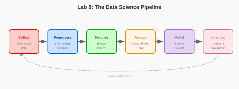
8.1 Learning Objectives
- Process neural datasets from raw data to analysis-ready formats
- Visualize spike trains, LFP, and calcium imaging data
- Apply dimensionality reduction techniques (PCA, t-SNE, UMAP)
- Implement spike sorting and neural decoding pipelines
- Practice reproducible data analysis workflows
8.2 Prerequisites
- Reading: Chapter 8: The Data Science Pipeline
- Libraries: NumPy, Matplotlib, Pandas, Scikit-learn
- Concepts: Data preprocessing, dimensionality reduction, visualization
8.3 Setup
Run this cell to import the required libraries and configure the plotting environment.
import numpy as np
import matplotlib.pyplot as plt
import pandas as pd
from sklearn.decomposition import PCA
from sklearn.manifold import TSNE

np.random.seed(42)
plt.rcParams['figure.figsize'] = (12, 8)
8.4 Part 1: Loading and Preprocessing Neural Data
8.4.1 Exercise 1.1: Simulating and Visualizing Spike Data
Run this cell to simulate multi-neuron spike data and visualize it as a raster plot. This demonstrates the first step in the data science pipeline: acquiring and exploring raw neural data.
## Simulate multi-neuron spike data
n_neurons = 50
n_trials = 100
trial_duration = 2.0  # seconds
fs = 1000  # Hz
n_timepoints = int(trial_duration * fs)

## Generate Poisson spike trains
spike_data = np.random.rand(n_trials, n_neurons, n_timepoints) < 0.01

## Visualize raster plot
plt.figure(figsize=(14, 8))
for neuron in range(10):  # Show first 10 neurons
    trial_idx = 0
    spike_times = np.where(spike_data[trial_idx, neuron, :])[0] / fs
    plt.vlines(spike_times, neuron, neuron+1, color='black', linewidth=1)

plt.xlabel('Time (s)', fontsize=12)
plt.ylabel('Neuron', fontsize=12)
plt.title('Spike Raster Plot (Trial 1)', fontweight='bold', fontsize=14)
plt.tight_layout()
plt.show()
Questions to consider: - What patterns do you observe in the spike raster plot? - How might spike patterns differ between behavioral conditions?
8.5 Part 2: Understanding Distributed Processing
8.5.1 Exercise 2.1: Visualizing MapReduce and Brain Parallel
Run this cell to generate a visualization comparing MapReduce architecture with the brain’s distributed processing system.
import matplotlib.pyplot as plt
import matplotlib.patches as mpatches
from matplotlib.patches import FancyBboxPatch, FancyArrowPatch
import numpy as np

def visualize_mapreduce_brain_analogy():
    """Visualize the parallel between MapReduce and brain distributed processing."""
    fig, axes = plt.subplots(1, 2, figsize=(14, 6))

    # Left panel: MapReduce
    ax1 = axes[0]
    ax1.set_xlim(0, 10)
    ax1.set_ylim(0, 10)
    ax1.set_aspect('equal')
    ax1.axis('off')
    ax1.set_title('MapReduce Architecture', fontsize=14, fontweight='bold')

    # Input data
    ax1.add_patch(FancyBboxPatch((4, 9), 2, 0.8, boxstyle="round,pad=0.05",
                                  facecolor='#e6f2ff', edgecolor='#0066cc', linewidth=2))
    ax1.text(5, 9.4, 'Big Data', ha='center', va='center', fontsize=10, fontweight='bold')

    # Map nodes
    map_colors = ['#ffcccc', '#ccffcc', '#ffffcc']
    for i, (x, color) in enumerate(zip([1.5, 5, 8.5], map_colors)):
        ax1.add_patch(FancyBboxPatch((x-0.8, 6.5), 1.6, 1, boxstyle="round,pad=0.05",
                                      facecolor=color, edgecolor='#666666', linewidth=1.5))
        ax1.text(x, 7, f'Map {i+1}', ha='center', va='center', fontsize=9)
        ax1.annotate('', xy=(x, 7.5), xytext=(5, 8.8),
                    arrowprops=dict(arrowstyle='->', color='#666666', lw=1.5))

    ax1.text(5, 6, 'Shuffle & Sort', ha='center', va='center', fontsize=10, style='italic', color='#666666')

    # Reduce nodes
    for i, x in enumerate([2.5, 7.5]):
        ax1.add_patch(FancyBboxPatch((x-0.8, 3.5), 1.6, 1, boxstyle="round,pad=0.05",
                                      facecolor='#e6ccff', edgecolor='#9966cc', linewidth=1.5))
        ax1.text(x, 4, f'Reduce {i+1}', ha='center', va='center', fontsize=9)

    # Arrows from map to reduce
    for mx in [1.5, 5, 8.5]:
        for rx in [2.5, 7.5]:
            ax1.annotate('', xy=(rx, 4.5), xytext=(mx, 6.5),
                        arrowprops=dict(arrowstyle='->', color='#cccccc', lw=0.8))

    # Output
    ax1.add_patch(FancyBboxPatch((4, 1), 2, 0.8, boxstyle="round,pad=0.05",
                                  facecolor='#ccffcc', edgecolor='#009900', linewidth=2))
    ax1.text(5, 1.4, 'Result', ha='center', va='center', fontsize=10, fontweight='bold')
    ax1.annotate('', xy=(5, 1.8), xytext=(2.5, 3.5),
                arrowprops=dict(arrowstyle='->', color='#666666', lw=1.5))
    ax1.annotate('', xy=(5, 1.8), xytext=(7.5, 3.5),
                arrowprops=dict(arrowstyle='->', color='#666666', lw=1.5))

    # Right panel: Brain distributed processing
    ax2 = axes[1]
    ax2.set_xlim(0, 10)
    ax2.set_ylim(0, 10)
    ax2.set_aspect('equal')
    ax2.axis('off')
    ax2.set_title('Brain Distributed Processing', fontsize=14, fontweight='bold')

    # Sensory input
    ax2.add_patch(FancyBboxPatch((4, 9), 2, 0.8, boxstyle="round,pad=0.05",
                                  facecolor='#ffe6e6', edgecolor='#cc0000', linewidth=2))
    ax2.text(5, 9.4, 'Sensory Input', ha='center', va='center', fontsize=10, fontweight='bold')

    # Sensory cortices (parallel processing)
    regions = [('Visual - Cortex', 1.5, '#ffcccc'), ('Motor - Cortex', 5, '#ccccff'),
               ('Auditory - Cortex', 8.5, '#ccffcc')]
    for name, x, color in regions:
        ax2.add_patch(FancyBboxPatch((x-0.9, 6.3), 1.8, 1.4, boxstyle="round,pad=0.05",
                                      facecolor=color, edgecolor='#666666', linewidth=1.5))
        ax2.text(x, 7, name, ha='center', va='center', fontsize=8)
        ax2.annotate('', xy=(x, 7.7), xytext=(5, 8.8),
                    arrowprops=dict(arrowstyle='->', color='#666666', lw=1.5))

    ax2.text(5, 5.8, 'Integration', ha='center', va='center', fontsize=10, style='italic', color='#666666')

    # Subcortical integration
    ax2.add_patch(FancyBboxPatch((3.5, 3.5), 3, 1.2, boxstyle="round,pad=0.05",
                                  facecolor='#e6ccff', edgecolor='#9966cc', linewidth=1.5))
    ax2.text(5, 4.1, 'Prefrontal Cortex - (Decision Making)', ha='center', va='center', fontsize=9)

    # Arrows from cortices to PFC
    for x in [1.5, 5, 8.5]:
        ax2.annotate('', xy=(5, 4.7), xytext=(x, 6.3),
                    arrowprops=dict(arrowstyle='->', color='#cccccc', lw=1.2))

    # Spinal cord (local execution)
    ax2.add_patch(FancyBboxPatch((4, 1), 2, 0.8, boxstyle="round,pad=0.05",
                                  facecolor='#ffffcc', edgecolor='#cc9900', linewidth=2))
    ax2.text(5, 1.4, 'Spinal Cord - (Motor Execution)', ha='center', va='center', fontsize=9)
    ax2.annotate('', xy=(5, 1.8), xytext=(5, 3.5),
                arrowprops=dict(arrowstyle='->', color='#666666', lw=1.5))

    plt.tight_layout()
    plt.show()

# Run the visualization
visualize_mapreduce_brain_analogy()
Questions to consider: - How does the brain’s hierarchical processing mirror the MapReduce paradigm? - What are the advantages of distributed processing in both systems?
8.6 Part 3: Signal Preprocessing
8.6.1 Exercise 3.1: Filtering Neural Signals
Run this cell to simulate a raw neural signal and apply preprocessing steps.
from scipy import signal

def simulate_and_preprocess_signal():
    """Simulate and preprocess a raw neural signal."""
    sampling_rate = 1000  # Hz
    duration = 5  # seconds
    t = np.linspace(0, duration, int(duration * sampling_rate), endpoint=False)

    # 1. Create a clean signal with alpha and gamma oscillations
    clean_signal = (1.5 * np.sin(2 * np.pi * 10 * t) +  # Alpha wave
                    0.5 * np.sin(2 * np.pi * 40 * t))   # Gamma wave

    # 2. Add noise
    line_noise = 1.0 * np.sin(2 * np.pi * 60 * t) # 60 Hz noise
    random_noise = 0.5 * np.random.randn(len(t)) # White noise
    raw_signal = clean_signal + line_noise + random_noise

    # 3. Preprocess: Apply notch and band-pass filters
    # Notch filter for 60 Hz line noise
    b_notch, a_notch = signal.iirnotch(60, 30, sampling_rate)
    signal_notched = signal.filtfilt(b_notch, a_notch, raw_signal)
    # Band-pass filter (1-100 Hz)
    b_band, a_band = signal.butter(4, [1, 100], btype='band', fs=sampling_rate)
    preprocessed_signal = signal.filtfilt(b_band, a_band, signal_notched)

    # --- Visualization ---
    fig, (ax1, ax2) = plt.subplots(2, 1, figsize=(12, 8), sharex=True)
    ax1.plot(t, raw_signal, label='Raw Signal', alpha=0.8)
    ax1.plot(t, clean_signal, label='Original Clean Signal', color='black', linestyle='--')
    ax1.set_title('Before Preprocessing')
    ax1.set_ylabel('Amplitude')
    ax1.legend()
    ax1.grid(True, linestyle='--')

    ax2.plot(t, preprocessed_signal, label='Preprocessed Signal', color='green')
    ax2.plot(t, clean_signal, label='Original Clean Signal', color='black', linestyle='--')
    ax2.set_title('After Preprocessing')
    ax2.set_xlabel('Time (s)')
    ax2.set_ylabel('Amplitude')
    ax2.legend()
    ax2.grid(True, linestyle='--')
    plt.tight_layout()
    plt.show()

# Run the preprocessing simulation
simulate_and_preprocess_signal()
Questions to consider: - Why do we use a notch filter for 60 Hz noise? - What is the purpose of the band-pass filter? - How well does the preprocessing recover the original clean signal?
8.7 Part 4: Dimensionality Reduction with PCA
8.7.1 Exercise 4.1: Basic PCA on Firing Rates
Run this cell to create a feature matrix from firing rates and apply PCA for dimensionality reduction. This demonstrates how to transform high-dimensional neural data into a lower-dimensional representation.
## Create feature matrix: firing rates in time bins
bin_size = 100  # ms
n_bins = n_timepoints // bin_size

firing_rates = np.zeros((n_trials, n_neurons, n_bins))
for trial in range(n_trials):
    for neuron in range(n_neurons):
        for bin_idx in range(n_bins):
            start = bin_idx * bin_size
            end = (bin_idx + 1) * bin_size
            firing_rates[trial, neuron, bin_idx] = spike_data[trial, neuron, start:end].sum()

## Reshape for PCA: (n_samples, n_features)
X = firing_rates.reshape(-1, n_neurons)

## Apply PCA
pca = PCA(n_components=3)
X_pca = pca.fit_transform(X)

## Visualize
fig = plt.figure(figsize=(14, 6))

## Variance explained
ax1 = fig.add_subplot(121)
ax1.bar(range(1, 11), pca.explained_variance_ratio_[:10], color='skyblue')
ax1.set_xlabel('Principal Component')
ax1.set_ylabel('Variance Explained')
ax1.set_title('PCA Scree Plot', fontweight='bold')

## 3D projection
ax2 = fig.add_subplot(122, projection='3d')
ax2.scatter(X_pca[:, 0], X_pca[:, 1], X_pca[:, 2], c=np.arange(len(X_pca)), cmap='viridis', alpha=0.6)
ax2.set_xlabel('PC1')
ax2.set_ylabel('PC2')
ax2.set_zlabel('PC3')
ax2.set_title('Neural Activity in PC Space', fontweight='bold')

plt.tight_layout()
plt.show()
Questions to consider: - How much variance is explained by the first few principal components? - What does the 3D projection reveal about the structure of the neural data?
8.7.2 Exercise 4.2: Visualizing Neural States During Different Tasks
Run this cell to simulate neural population activity during two different tasks and visualize the separation using PCA.
def visualize_neural_states():
    """Simulate and visualize neural population activity with PCA."""
    n_neurons = 50
    n_samples_per_task = 100

    # Task A: Neurons 0-24 are active
    task_A_activity = np.random.randn(n_samples_per_task, n_neurons)
    task_A_activity[:, 25:] *= 0.1 # Other neurons are quiet

    # Task B: Neurons 25-49 are active
    task_B_activity = np.random.randn(n_samples_per_task, n_neurons)
    task_B_activity[:, :25] *= 0.1 # Other neurons are quiet

    # Combine data and create labels
    full_activity = np.vstack([task_A_activity, task_B_activity])
    labels = np.array(['Task A'] * n_samples_per_task + ['Task B'] * n_samples_per_task)

    # Apply PCA
    pca = PCA(n_components=3)
    activity_reduced = pca.fit_transform(full_activity)

    # --- Visualization ---
    fig = plt.figure(figsize=(10, 8))
    ax = fig.add_subplot(111, projection='3d')
    for task_name, color in [('Task A', 'blue'), ('Task B', 'red')]:
        mask = labels == task_name
        ax.scatter(activity_reduced[mask, 0], activity_reduced[mask, 1], activity_reduced[mask, 2],
                   c=color, label=task_name, alpha=0.6)

    ax.set_title('Neural States Visualized with PCA')
    ax.set_xlabel('Principal Component 1')
    ax.set_ylabel('Principal Component 2')
    ax.set_zlabel('Principal Component 3')
    ax.legend()
    plt.show()

# Run the neural states visualization
visualize_neural_states()
Questions to consider: - Can you see clear separation between Task A and Task B in the PCA space? - What does this tell you about how neural populations encode different behaviors? - How many principal components are needed to capture most of the variance?
8.8 Part 5: Advanced Exercises
8.8.1 Exercise 5.1: Apply t-SNE and UMAP to Neural Data
#| eval: false
from sklearn.manifold import TSNE
import umap

# TODO: Apply t-SNE to the neural data
# Hint: Use TSNE(n_components=2, perplexity=30)
tsne = TSNE(n_components=2, perplexity=30, random_state=42)
X_tsne = tsne.fit_transform(X)

# TODO: Apply UMAP to the neural data
# Hint: Use umap.UMAP(n_neighbors=15, min_dist=0.1)
reducer = umap.UMAP(n_neighbors=15, min_dist=0.1, random_state=42)
X_umap = reducer.fit_transform(X)

# TODO: Visualize both results side by side
# Compare how well each method separates the data
8.8.2 Exercise 5.2: Implement Spike Sorting Using PCA + Clustering
#| eval: false
from sklearn.cluster import KMeans

# TODO: Simulate raw electrode data with multiple neurons
# TODO: Extract spike waveforms
# TODO: Apply PCA to reduce waveform dimensionality
# TODO: Use K-means clustering to separate spike types
# TODO: Visualize the sorted spike clusters
8.8.3 Exercise 5.3: Create Interactive Visualizations with Plotly
#| eval: false
import plotly.graph_objects as go
from plotly.subplots import make_subplots

# TODO: Create an interactive 3D scatter plot of the PCA results
# TODO: Add hover information showing trial number and time bin
# TODO: Allow zooming and rotation for better exploration
8.8.4 Exercise 5.4: Build a Complete Preprocessing Pipeline
#| eval: false
# TODO: Create a function that:
# 1. Loads raw neural data
# 2. Applies notch filtering
# 3. Applies band-pass filtering
# 4. Removes artifacts (values > 5 std)
# 5. Normalizes the signal (z-score)
# 6. Returns clean, analysis-ready data
8.9 Summary
In this lab, you have:
- Visualized distributed processing by comparing MapReduce architecture with the brain’s hierarchical processing system
- Preprocessed neural signals using notch filters and band-pass filters to remove noise
- Applied dimensionality reduction with PCA to visualize high-dimensional neural data
- Explored neural states by simulating population activity during different tasks
- Practiced advanced techniques with t-SNE, UMAP, spike sorting, and interactive visualizations
These skills form the foundation of the neural data science pipeline, preparing you for real-world analysis of electrophysiology, EEG, and calcium imaging data.